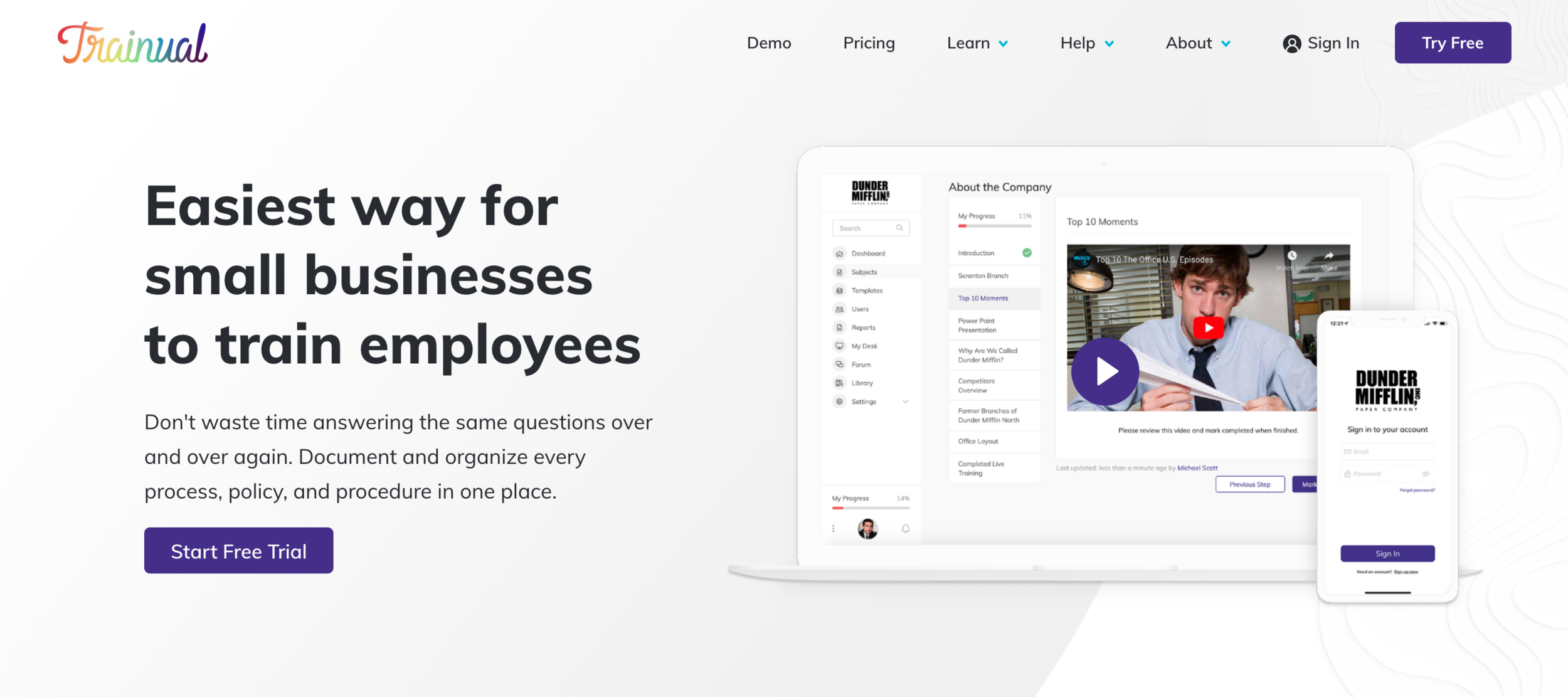
Trainual

CLIENT: Trainual
DELIVERABLES: A clickable mobile application prototype through Adobe Xd
MY ROLE: UX Consultant
CHALLENGE: After a customer has entered in the trial period for Trainual’s software, the user interacts with a setup wizard. The goal was to increase the trialing customer to paid customer conversion rate by 10% when using the new wizard by end of quarter.
SOLUTION: A clickable prototype specifically for desktop to see where the process can be improved.
WHAT I LEARNED: When processes need to be made more efficient, the user and their needs will always provide direction. We can assume as much as we’d like, or we can let our primary users tell us what they need and where they need it.
PROCESS
RESEARCH
To begin the project, I had to start with the user. I needed to know everything I could about Trainual and it’s users. I not only had to immerse my self within their platform, but I had to understand what kind of people also use this product. Who are they? What do they do? What do they need? How do they feel? etc. I was able to work closely with the head of product to develop a list of attributes that encompass the users, while also working on my own to get a firm grasp on the user’s journey.
PROTO-PERSONA
Once I had a firm grasp on the software and it’s users, I needed to solidify this data into an easy to reference figure. I developed a set of thoughts, feeling and emotions based on the aforementioned data. This list of attributes was not only a list, but a set of guides that would dictate how we can improve the flow of the setup wizard. Almost immediately, I started to hear what the user needed (no, not literally).

FLOW OPTIMIZATION
I started our mapping out two different flows. Breaking this down allowed a clear visual process to be seen without any distractions. The first flow helped to show what exists today, while the second one was built based on what our proto-persona wanted to see. This allowed for a simple comparison between what exists and what is being proposed.

HEAURISTIC EVALUATION
Now that we had the proposed flow for the user, it was time to analyze the UI and layout of the current flow to see what can be improved. After the evaluation was complete, I found two things that can be implemented to improve the wizard.
Step indicator to tell the users where they are in the flow
Placing it slightly more in frame to allow for a slightly faster action
PROTOTYPING
The final step was taking these suggestions and creating a clickable Prototype as a deliverable for the Trainual team. I was able to do so using Xd as their art boards have the ability to act as a hot spot, similar to that of InVision.